
How Maps Twist our Perception of the World...
I recently came across an awesome set of examples of how maps twist our perception of the world. I first learned about this on an episode of West Wing (you can see the awesome clip here) – it is really eye-opening how a simple display can change how you perceive of a country or continent.
First, flattening a globe distorts the image! You can distort the size of the countries, or you can the distort the shape – but oftentimes we just have the wrong idea of how countries compare to one another based on how maps are designed and used. The biggest example of how poor our perception of the relative size of countries is the sheer size of the African continent:

Second, you also don’t get an appreciation for the length, width, and distance between countries. Take for example the width of the country of Russia versus the entire continent of Africa. In most maps, you’ll see the map drawn as below, but the actual width of the African continent is more than that of continental Russia. It just never appears that way because of how maps are traditionally drawn.

The twitter thread has a ton of different examples of this – a lot of them similarly fascinating. They also share the common theme that in general, countries near the equator (often poorer countries as well) appear smaller than they are on Mercator maps – which represent north as up, south as down, and preserve local directions and shapes above all else. What this means though, is that the Mercator maps inflate the size of countries the further they are from the equator – making Greenland, Russia, Antarctica and Canada appear much larger than they are. The Gall-Peters maps preserves the size of countries and instead choses to distort the shape of them. The Gall-Peters projection is now promoted by UNESCO, and is slowly making its way into geography classes across the globe. You can see the difference below:
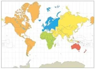
Mercator Map
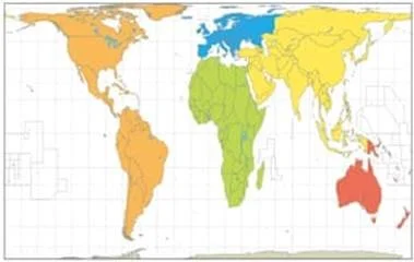
Galls-Peters Map
I hope that this little nugget might plant a seed within us – so that we understand that the way we see images and data can be distorted to impact our world view. And taking a closer look at those distortions might lead to a better understanding of the countries and continents around the world that we might never visit or know more about. This little part of the show the West Wing has stuck with me in a lot of different ways. For one, I hung a Gall-Peters projection map in my living room so that I might always be facing this reality and change my focal point a little bit. But it also is just a small reminder that you can change people’s minds and hearts.
With the right map.